Double-click a selected grid to display an Appearance Window that displays grid properties, including its name, help string, text string, border, eight currently selected color properties, and lots more.
You can enter new text values to change gridName , helpString , hintString , and textString properties. Click Text$[] to display a window that accepts the multiline textArray property. Click Text$[] again to hide the window and update the grid.
You can change any or all of the color properties by clicking on the color property button you want to change, then colors in the palette. The appearance of the grid changes instantly to reflect your choices.
You can change border styles by clicking on border samples. To set the secondary border style for grids that support two styles, hold the Shift key down when you click on the border sample.
You can align text to one of nine different nominal positions, then fine tune text location them with indent controls. And you can select left, center, right, or both justification for grids that support it.
Click Restore to reset the properties of the grid to the values they had when you starting editing it.
Click Defaults to make all its properties revert to the nominal values of its grid type.
Click Cancel to hide the Appearance window.
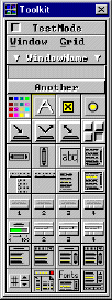
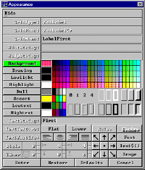
Toolkit Appearance Window